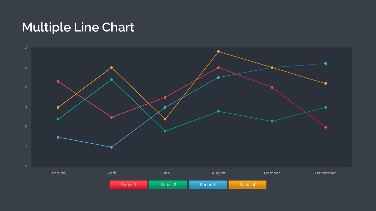
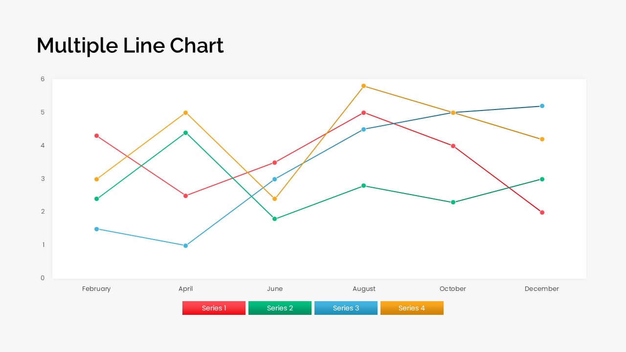
A multiple line chart powerpoint template is used to represent quantitative data or information by displaying the relationship between one or more variables using a series of connected points on lines or curves. It aids in comparing the trend of one variable with one or more other variables, showcasing changes in values as they increase, decrease, fluctuate, or remain constant. The Multiple Line Chart PPT template is designed as a grouped line graph, enabling effective visualization of these trends and value changes.
The multiple line chart PowerPoint template consists of four lines and is designed specifically to illustrate multiple points. This type of graph displays many series of data on the same coordinate system. Users can utilize this template to showcase various data series that share common values on the horizontal axis while potentially differing on the vertical axis.
Multiple line chart PowerPoint templates can be used in various scenarios, including:
• Comparing Trends: Displaying multiple data series on the same graph allows for easy comparison of trends over time or across different categories.
• Analyzing Relationships: The lines connecting the data points help visualize the relationship between different variables and identify correlations or patterns.
• Tracking Performance: Multiple line charts in PowerPoint can be utilized to monitor the performance of different metrics or variables and identify areas of improvement or success.
• Presenting Comparative Data: This line graph template is effective for showcasing the differences in data between various groups, demographics, or regions, providing insights into variations and disparities.
The multiple-line graph ppt is useful for comparing trends in different activities or operations. Examples include comparing the progression of different diseases over time or examining the impact of the same disease in different demographics. Additionally, this template can be employed to illustrate year-wise and quarter-wise growth.
The PowerPoint line chart will effectively represent quantitative data through dotted segments, with each dot representing a specific value. The lines in the graph indicate the relationship between these dots. Each dotted line is separately colored in red, green, blue, and yellow. The presenters can use the segmented columns at the bottom as legends to display results. Download 100% editable
graphs and charts from SlideBazaar!